16 Kitchen Color Scheme Ideas for a Fresh and Stylish Cook Space
 By zarcoyt2025
Picking a kitchen colour is straightforward until you realise the colour has to work across five different surfaces — cabinets, walls, countertop, backsplash, and hardware — that all sit within arm’s reach of each other. A sage that looks perfect on a paint chip can clash with your granite, and a navy that photographs beautifully might swallow a kitchen that only gets north-facing light. These kitchen color scheme ideas solve the coordination problem by giving you complete palettes, not isolated swatches, so every surface speaks the same visual language.
Below are sixteen kitchen colour systems built around real material combinations. Each idea covers the cabinet colour, wall tone, countertop surface, backsplash choice, and hardware metal, plus the kind of natural and artificial light that makes the combination perform. Whether you are painting existing cabinets or planning a full renovation, there is a scheme here that will save you from the sample-card guessing game.
1. Sage Green Cabinets With White Marble and Brass
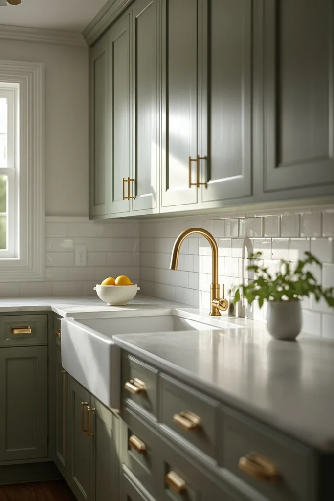
Sage green lower cabinets paired with a white marble countertop and warm brass hardware is a combination that manages to look both classic and current. Choose a muted, grey-toned sage rather than a bright green — the grey undertone keeps the kitchen from reading too country and pairs cleanly with the cool veining in marble. Paint the upper cabinets or open shelving in warm white to keep the room airy, and carry the white onto the walls above the backsplash. Use a simple white subway tile or a slab backsplash in the same marble as the countertop so the colour story stays tight. The brass hardware should be unlacquered or satin rather than high-polish, which can look too formal for a kitchen setting.
Paint Picks: Benjamin Moore Cushing Green HC-125, Sherwin-Williams Retreat SW 6207, Behr Sage Green N390-4
2. Navy Lower Cabinets With White Uppers for Kitchen Color Scheme Ideas
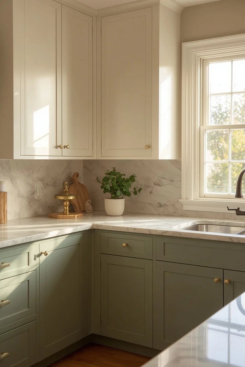
A navy-and-white two-tone kitchen is a modern classic that adds depth without making the room dark. Paint the lower cabinets and island in a rich navy, keep the upper cabinets in bright white, and choose a white quartz or marble countertop to bridge the two tones. The navy draws visual weight downward, grounding the kitchen, while the white uppers and ceiling keep the room open. Use polished nickel or brushed gold hardware — both metals complement navy without competing.
A white subway tile backsplash with grey grout adds subtle pattern, and open shelving in natural wood introduces warmth between the upper cabinet sections. Test the navy at night under your kitchen lights before committing, because dark blues can shift toward purple under warm LEDs.
Paint Picks: Benjamin Moore Hale Navy HC-154, Sherwin-Williams Naval SW 6244, Behr Midnight Blue HDC-CL-26
3. All-White Kitchen With Warm Wood Accents
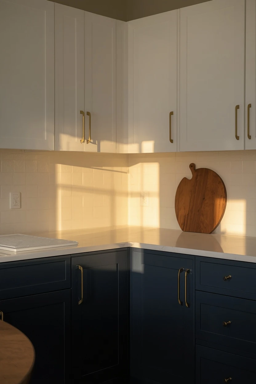
An all-white kitchen avoids the clinical trap when you layer in warm wood across the island top, open shelving, and cutting boards left on display. Paint the cabinets in a warm white with a slight yellow or cream undertone — not a blue-white, which looks sterile in kitchens — and choose a countertop in a white-veined quartz or marble.
The warm wood accents should all come from the same tonal family: honey oak, light walnut, or ash so they read cohesive rather than random. Use brass or matte gold hardware to add a warm metallic that supports the wood tones, and introduce one natural textile — a striped linen runner or a woven basket — to ground the space.
Paint Picks: Benjamin Moore White Dove OC-17, Sherwin-Williams Alabaster SW 7008, Behr Ultra Pure White 1850
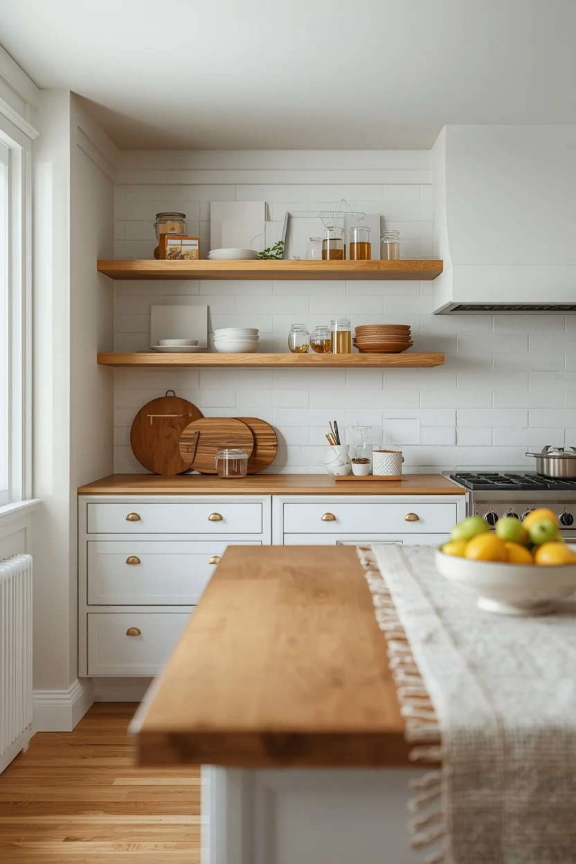
The maintenance reality: white cabinets show grease splatter, fingerprints, and scuff marks faster than any other colour, so a satin or semi-gloss sheen that wipes clean is essential.
4. Charcoal and Cream Two-Tone With Matte Black Hardware
Charcoal lower cabinets and cream upper cabinets create a modern, grounded kitchen that carries enough weight to anchor an open-plan living area. Choose a charcoal with a warm brown undertone rather than a cool grey to keep the kitchen inviting, and pair it with a cream wall colour rather than bright white to soften the contrast. A honed or leathered granite countertop in a warm grey or black carries the dark tone across the work surface without adding another colour.
Paint Picks: Benjamin Moore Kendall Charcoal HC-166, Sherwin-Williams Iron Ore SW 7069, Behr Intellectual PPU18-19
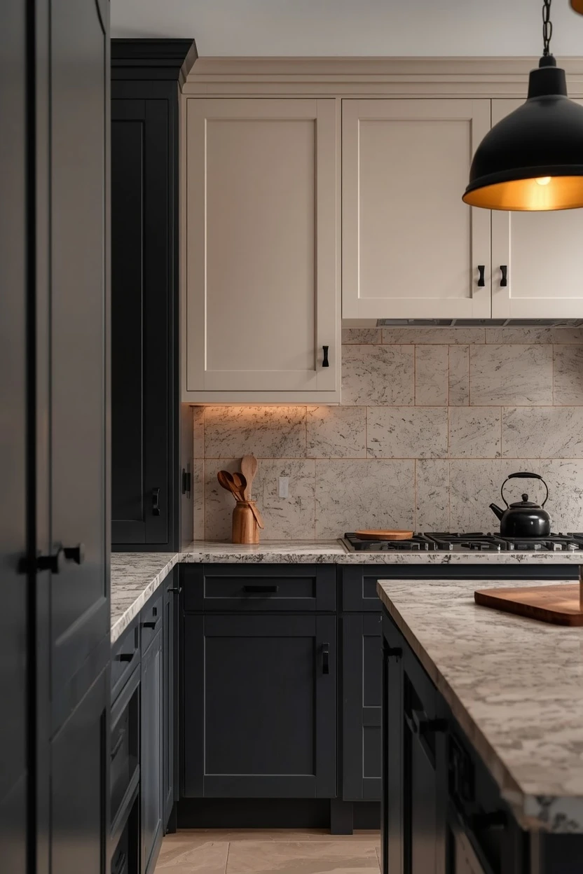
Matte black hardware — bar pulls for the lowers, knobs for the uppers — ties the metalwork to the darker cabinets. The backsplash should provide the neutral bridge: a warm white handmade zellige tile or a simple subway in a soft cream both work to mediate between the charcoal and cream.
5. Warm Terracotta Painted Kitchen Ideas
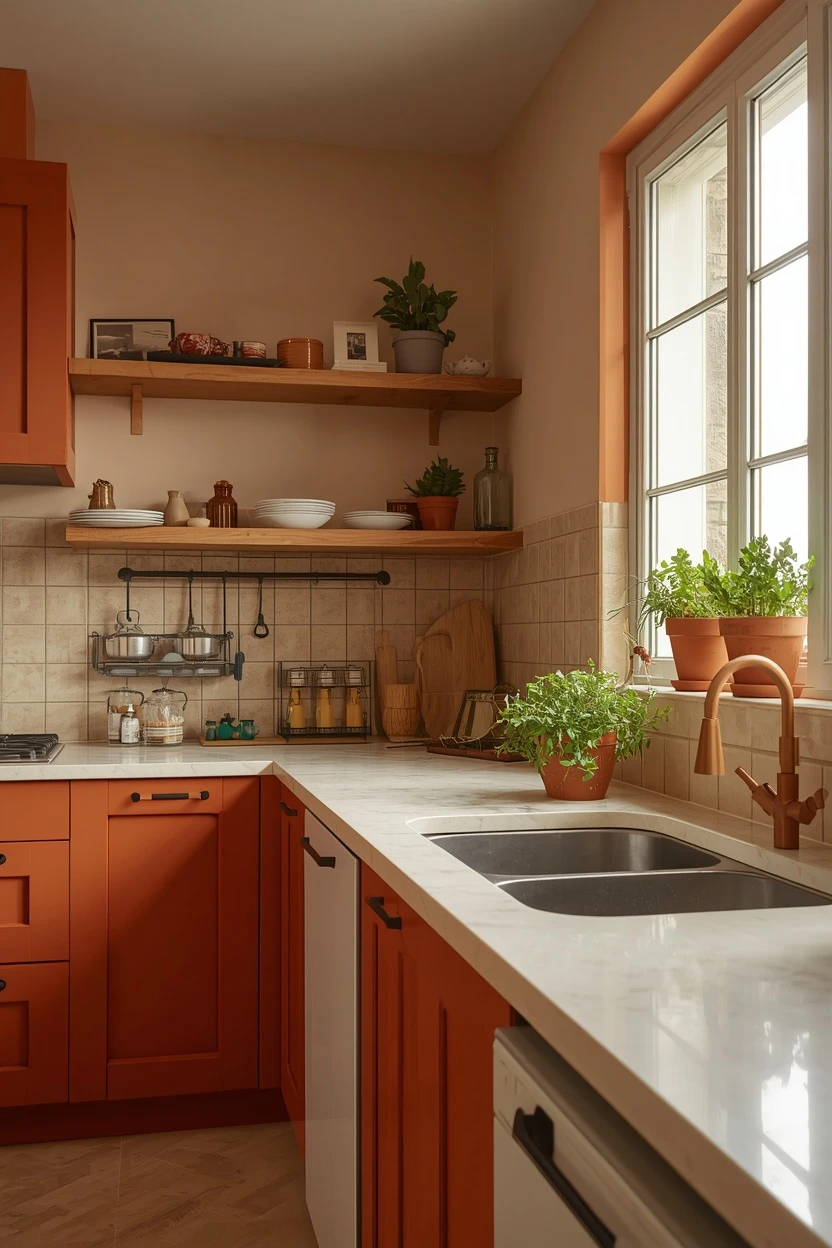
Terracotta-painted cabinets bring Mediterranean warmth to a kitchen in a way that no other colour quite replicates. Choose a muted terracotta that leans toward clay rather than orange, and pair it with open shelving in natural wood and a white or cream countertop to prevent the warm tone from becoming heavy. Use a simple handmade tile backsplash in off-white or a soft cream — anything too white will look harsh next to the earthy cabinet colour. Matte brass or unlacquered copper hardware amplifies the rustic warmth, and woven baskets on the open shelves carry the natural-material theme. The trade-off is trend timing: terracotta cabinets are a strong current choice, but they represent a bolder commitment than a neutral, so be confident before you brush the first coat.
Paint Picks: Benjamin Moore Cavern Clay 662, Sherwin-Williams Warm Stone SW 7536, Behr Canyon Dusk S210-4
6. Soft Grey-Blue Cabinets With Butcher Block Counters
A soft grey-blue cabinet colour paired with a butcher-block countertop in maple or oak creates a kitchen that balances cool and warm without leaning too far in either direction. The grey-blue reads as a sophisticated neutral that shifts character with the light — cooler in the morning, warmer in the evening — and the butcher block provides a living surface that develops character over time. Use brushed nickel or pewter hardware for a subtle metallic that does not fight the soft colour, and choose a white or light grey backsplash tile in a simple format.
Paint Picks: Benjamin Moore Boothbay Gray HC-165, Sherwin-Williams Uncertain Gray SW 6234, Behr Frozen Pond N480-2
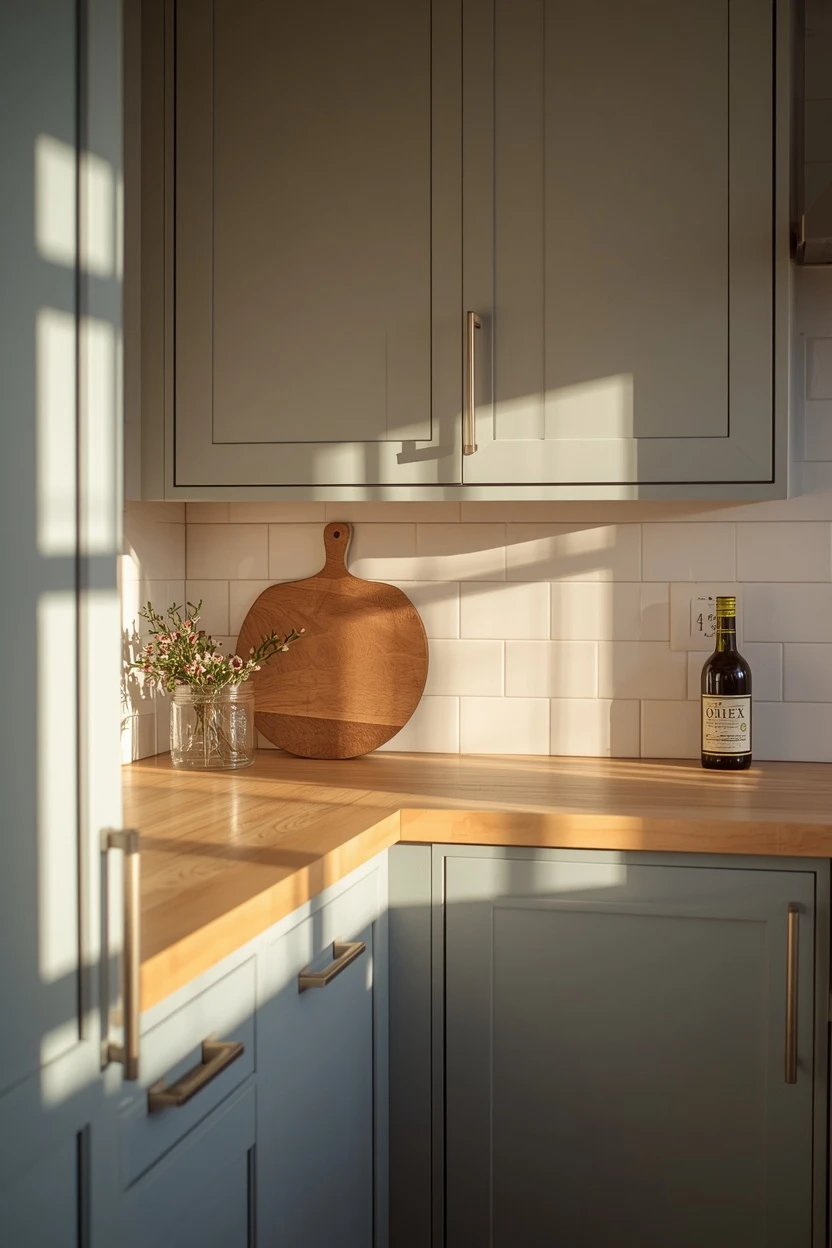
Oil the butcher block monthly with a food-safe mineral oil to keep the wood from drying out and cracking — this is not a set-and-forget countertop, so factor in the maintenance commitment before choosing it over stone.
7. Black Cabinets With Brass for Kitchen Painting Ideas
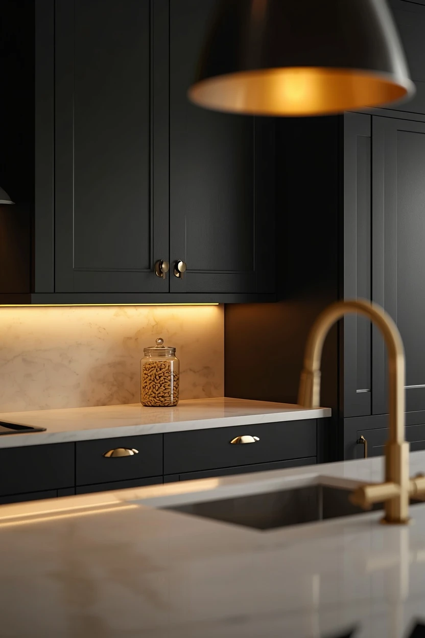
Black cabinets with brass hardware is a combination that reads sophisticated and dramatic in kitchens with enough natural light to support the dark surface. Choose a warm black — one with a hint of brown or green — rather than a pure jet black, which absorbs too much light and shows every fingerprint. Pair the black cabinets with a light countertop in white marble, white quartz, or a warm concrete to create a strong contrast that keeps the workspace visible. A white or off-white backsplash extends the light surface and reflects light back into the room.
Brass cup pulls and knobs glow against the dark surface, adding warmth and a focal point to every cabinet door. The caution: black shows water marks, grease, and dust more than any other colour, so a matte or satin sheen is essential for hiding daily wear.
Paint Picks: Benjamin Moore Black Panther 2125-10, Sherwin-Williams Tricorn Black SW 6258, Behr Jet Black ECC-10-2
8. Forest Green and Natural Stone for Kitchen Color Scheme Ideas
Forest green cabinets paired with a natural stone countertop — soapstone, honed granite, or a warm-toned quartzite — deliver a kitchen that grounds itself in nature-inspired materials. The green should be deep enough to register as a deliberate colour choice, not a greyed-out neutral, and the stone should carry warm veining or flecking that connects to the organic theme.
Use a backsplash in a warm handmade tile — a zellige in cream or a terracotta-toned ceramic — to add texture behind the work area. Matte black or oil-rubbed bronze hardware complements the dark green without adding another warm metal to compete with the stone.
Paint Picks: Sherwin-Williams Isle of Pines SW 6461, Benjamin Moore Hunter Green 2041-10, Behr Perennial Green S-H-460
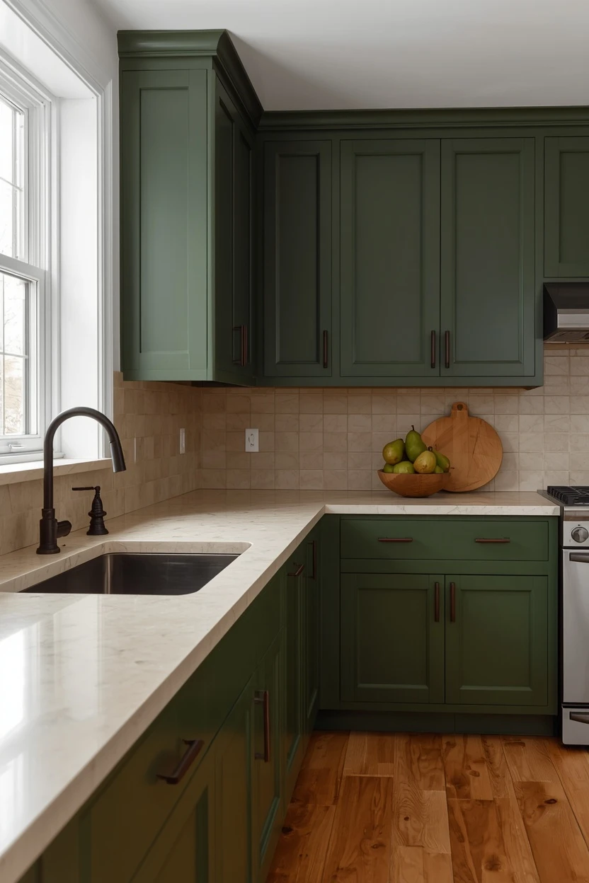
Open shelving in natural walnut above the counter connects the green and stone through a warm wood midpoint.
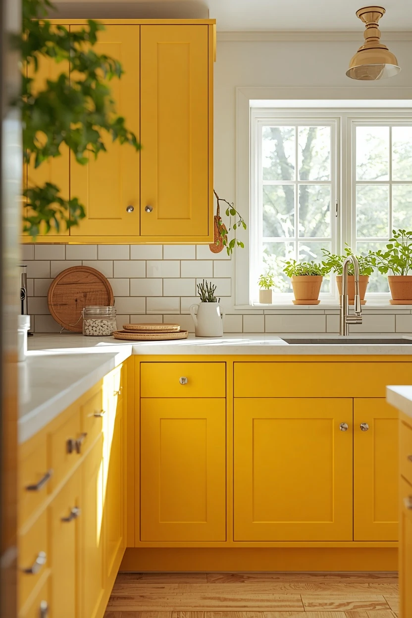
9. Butter Yellow Cabinets for a Cheerful Kitchen
Butter yellow cabinets bring a permanent sunny disposition to kitchens that lack natural light, compensating for grey skies and north-facing windows with built-in warmth. Choose a soft buttery shade — not a bright lemon — that reads warm rather than loud, and pair it with a white countertop and white walls so the yellow has room to breathe. Simple polished nickel or white ceramic knobs keep the hardware understated, and a white subway tile backsplash provides a classic backdrop. Introduce a few green elements — potted herbs on the windowsill, a trailing ivy on an open shelf — to balance the yellow with a complementary natural colour. Avoid pairing yellow cabinets with yellow walls, which doubles the intensity and creates an overwhelming effect that tires the eye quickly.
Paint Picks: Benjamin Moore Hawthorne Yellow HC-4, Sherwin-Williams Butter Up SW 6681, Behr Sunflower Seed P290-3
10. Greige Cabinets With Warm White and Brass
Greige cabinets — that grey-beige hybrid — offer the neutrality of grey with the warmth of beige, making them the safest choice for homeowners who want colour without risk. Pair them with warm white walls, a white quartz countertop with subtle warm veining, and brass or satin gold hardware that reinforces the warm side of the greige undertone. A cream or warm white subway tile backsplash maintains the neutral lane, and open shelving in light oak introduces the only real colour variation through natural wood.
Paint Picks: Sherwin-Williams Mega Greige SW 7031, Benjamin Moore Revere Pewter HC-172, Behr Wheat Bread N300-4
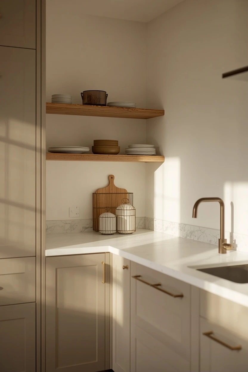
The advantage of greige is longevity: it does not date the way trend colours do, and it pairs with virtually any accent colour if you want to update cushions, towels, or decor items seasonally without repainting.
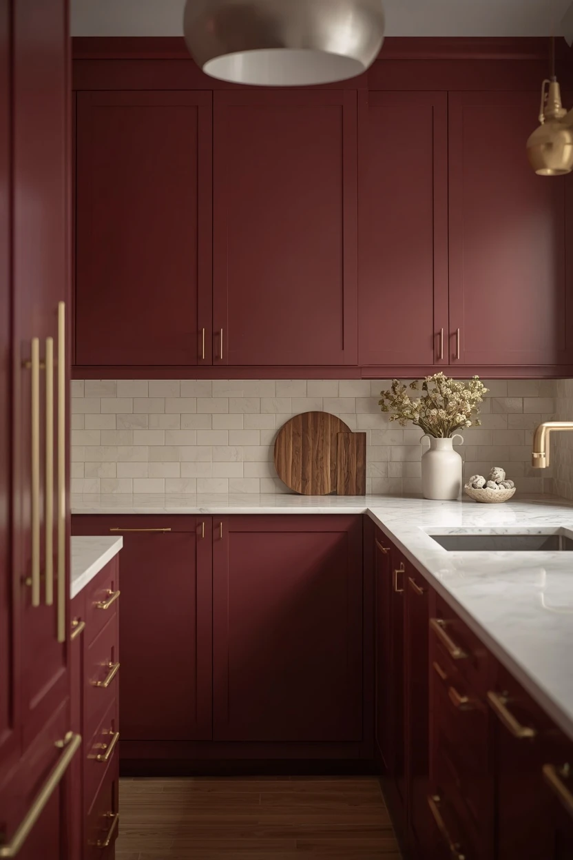
11. Deep Plum Cabinets for a Bold Statement
Deep plum kitchen cabinets are not common, which is exactly why they make such a strong statement. The rich purple-brown undertone reads sophisticated under warm lighting and pairs surprisingly well with warm white countertops and matte gold or brass hardware. Keep the walls in a soft warm white to let the cabinet colour command the room, and choose a backsplash in a simple cream or warm white tile so the plum is the single bold element. Natural wood accents in walnut or cherry reinforce the warm undertone of the plum and prevent it from looking cold.
The practical caution: deep colours show every imperfection in the door surface, so ensure your cabinet doors are smooth and properly primed before applying the colour.
Paint Picks: Benjamin Moore Kalamata AF-630, Sherwin-Williams Plum Brown SW 6272, Behr Mulberry Wine MQ1-38
12. Olive and Cream for a Warm Organic Kitchen
Olive green cabinets paired with cream walls and a warm stone countertop create a kitchen that draws from nature without trying too hard. The olive should lean toward a brown-green — not a bright olive — so it reads warm and grounded in residential lighting.
A cream quartz or limestone countertop provides a soft, warm work surface that connects to the earthy cabinet colour, and a backsplash in an off-white or cream handmade tile adds subtle texture. Use matte black or antique brass hardware depending on whether you want the kitchen to lean modern or traditional.
Paint Picks: Sherwin-Williams Ripe Olive SW 6209, Benjamin Moore Rosemary Sprig 2144-30, Behr Botanical Green S390-6
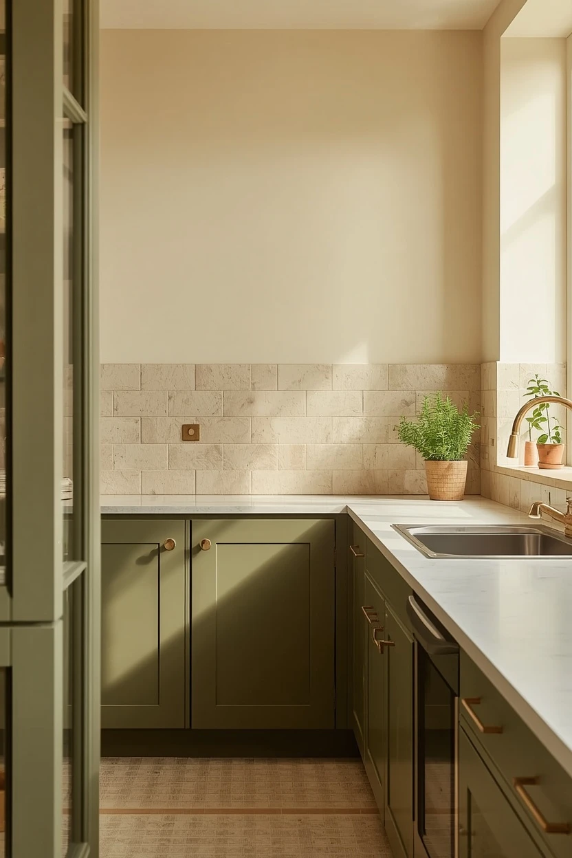
A single wooden shelf above the sink for dish soap and a small plant is all the styling this palette needs — the colours do the talking.
13. Blush Pink Cabinets for Soft Modern Kitchen Color Scheme Ideas
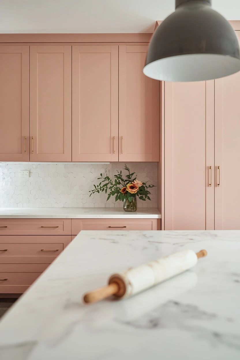
Blush pink kitchen cabinets push the boundaries of conventional kitchen colour while remaining surprisingly livable when paired with the right materials. Choose a dusty or muted blush — not a bright pink — and pair it with a white marble or quartz countertop and brass hardware so the pink reads warm and grown-up. White walls keep the room fresh, and a simple white subway or hexagonal tile backsplash provides a clean geometric backdrop. Introduce grey or charcoal through a bar stool, a pendant light shade, or a kitchen runner to ground the pink and prevent it from becoming saccharine. This palette suits open-plan kitchens where the cabinets are visible from the living area — the blush adds personality without clashing with neutral living room furniture on the other side of the room.
Paint Picks: Benjamin Moore Pale Berry 2103-60, Sherwin-Williams Fading Rose SW 6296, Behr Mallow PPG1058-3
14. Warm Taupe Cabinets With Dark Countertops
Warm taupe cabinets with a dark countertop in black granite or dark soapstone deliver a grounded, sophisticated kitchen that works in both traditional and modern settings. The taupe — a warm brown-grey — bridges cool and warm undertones, making it one of the most adaptable cabinet colours available. Use a simple white or cream backsplash to lighten the area between the dark countertop and the taupe cabinets, and choose brushed nickel or pewter hardware for a soft metallic that does not compete with the dark surfaces.
Paint Picks: Benjamin Moore Smokey Taupe 983, Sherwin-Williams Poised Taupe SW 6039, Behr Mocha Latte S220-6
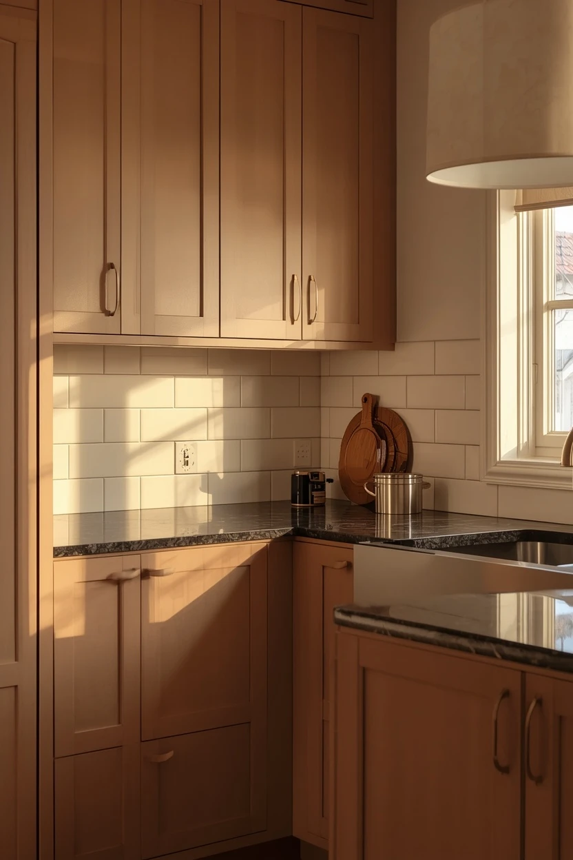
A pendant light with a warm fabric shade or a matte finish brings a residential softness that balances the weight of the dark countertop. This combination is forgiving of daily mess and ages gracefully because neither the taupe nor the dark stone shows stains or wear marks as readily as white.
15. Rust-Red Accent Island in a White Kitchen
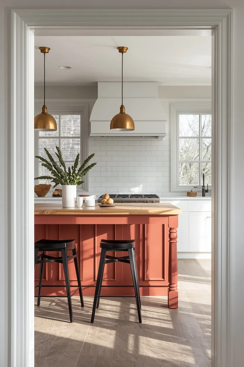
Painting just the kitchen island in a bold rust-red while keeping the perimeter cabinets white gives you a focal-point colour that does not overwhelm the room. The rust acts as an anchor in the centre of the kitchen, drawing the eye to the work zone and adding personality to an otherwise neutral space. Choose a muted rust — not a fire-engine red — and pair it with a warm wood or butcher-block island top to reinforce the earthy tone. The perimeter countertops should stay white or light grey to maintain contrast, and the backsplash should remain simple and neutral. Brass or matte black hardware on the island coordinates with the rust, while the white perimeter cabinets carry polished nickel for a subtle distinction between the two zones.
Paint Picks: Benjamin Moore Firenze AF-225, Sherwin-Williams Roycroft Copper Red SW 2839, Behr Red Pepper PPU2-02
16. Two-Tone Blue and White Coastal Kitchen
A coastal kitchen built on a two-tone scheme of soft ocean blue lower cabinets and white uppers creates a breezy, relaxed cook space that suits waterfront homes and landlocked kitchens alike. Choose a blue with a slight grey undertone rather than a bright aqua, which can look dated quickly. Pair it with a white quartz countertop and a white shiplap or beaded-board backsplash for a textured backdrop that reinforces the coastal feel. Brushed nickel or chrome hardware keeps the metalwork cool to match the blue, and natural woven baskets on the open shelves add warmth and organic texture.
Paint Picks: Benjamin Moore Van Courtland Blue HC-145, Sherwin-Williams Uncertain Gray SW 6234, Behr Watery HDC-CT-26
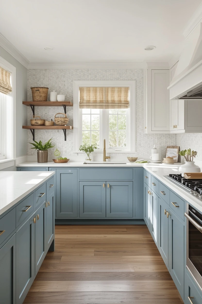
A butcher-block section on the island — even just a small prep area — introduces the warm wood element that prevents the blue and white from reading too cold. Keep the floor in a light wood or a large-format porcelain tile in a warm sand tone to ground the room with a beach-inspired neutral.
Where I’d Start if I Only Did Three Things
If I only did three things, I’d start by choosing one bold cabinet colour for the lower cabinets or island and keeping the uppers in warm white — that two-tone split is the single most impactful move in a kitchen refresh. Second, I’d swap the hardware to a metal that complements the new colour: brass for warm tones, polished nickel for cool tones, and matte black for dark cabinets. Third, I’d add a backsplash in a simple handmade tile that introduces texture without competing with the cabinet colour, because a flat painted wall behind the stove always reads unfinished.
Frequently Asked Questions
What are the most popular kitchen color scheme ideas right now?
Sage green, warm white with wood accents, and navy two-tone schemes are leading current kitchen design. All three lean toward natural materials and warm metallics, reflecting a broader shift away from the all-grey kitchens that dominated the previous decade. Earthy tones like terracotta and olive are also gaining traction in design-forward homes.
Should I paint kitchen cabinets the same colour as the walls?
Painting cabinets and walls the same colour can create a seamless, enveloping look that works especially well with muted tones like sage, greige, or soft blue. However, a slight contrast — cabinets one shade darker or a different sheen from the walls — gives the eye more to read and prevents the kitchen from looking flat. A satin cabinet next to a matte wall provides that subtle distinction.
What countertop colours pair best with painted cabinets?
White or light-veined quartz and marble are the most versatile countertop choices because they pair with virtually any cabinet colour and reflect light back into the workspace. Butcher block pairs naturally with blue, green, and white cabinets. Dark countertops in granite or soapstone pair best with light or warm-toned cabinets where the contrast adds drama without darkening the room.
How do I choose between warm and cool kitchen colours?
Look at the natural light in your kitchen. North-facing kitchens with cool light benefit from warm colours — cream, sage, terracotta, butter yellow — that compensate for the blue cast. South- and west-facing kitchens with warm afternoon light can handle cooler tones like navy, grey-blue, or charcoal without looking cold. Test samples on the wall and view them at multiple times of day before deciding.
Final Thoughts
The right kitchen colour scheme coordinates every surface in the room — not just the cabinets — into a palette that works from morning coffee to evening cleanup. These kitchen color scheme ideas give you complete combinations of cabinet colour, wall tone, countertop, backsplash, and hardware so you can move forward with confidence instead of second-guessing swatches. Choose the palette that matches your kitchen’s light, your lifestyle’s demands, and your taste’s direction, and commit to it as a coordinated system rather than a collection of individual colour picks.

zarcoyt2025
Khawar Iqbal is the founder and editor of Cozy Homes Hub. He writes about cozy, livable home decor — from small-apartment layouts to room-by-room styling guides — with a focus on warm palettes, layered lighting, and budget-friendly ideas that actually work in real homes.
Related Articles
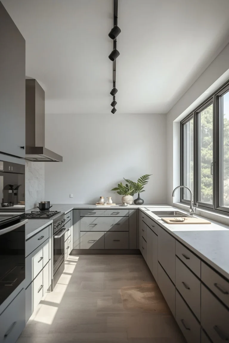
14 Kitchen Track Lighting Ideas for a Modern Upgrade
The biggest mistake people make with kitchen track lighting is treating it as a cheap workaround for missing recessed cans. That outdated…
Read more →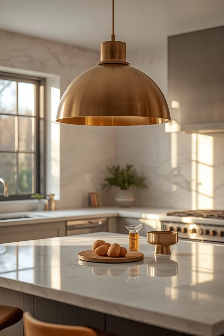
16 Kitchen Light Fixture Ideas That Transform Any Space
Walk into any well-designed kitchen and the first thing that pulls your eye upward is the light fixture. It anchors the entire…
Read more →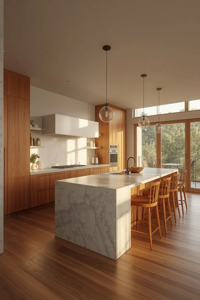
15 Kitchen Layout Ideas That Improve How You Cook
Most kitchen layout ideas start with a shape — L, U, galley — and then try to squeeze your life into that…
Read more →