18 Living Room Color Ideas to Refresh Your Space
July 8, 2026 · 16 min read
 By Khawar Iqbal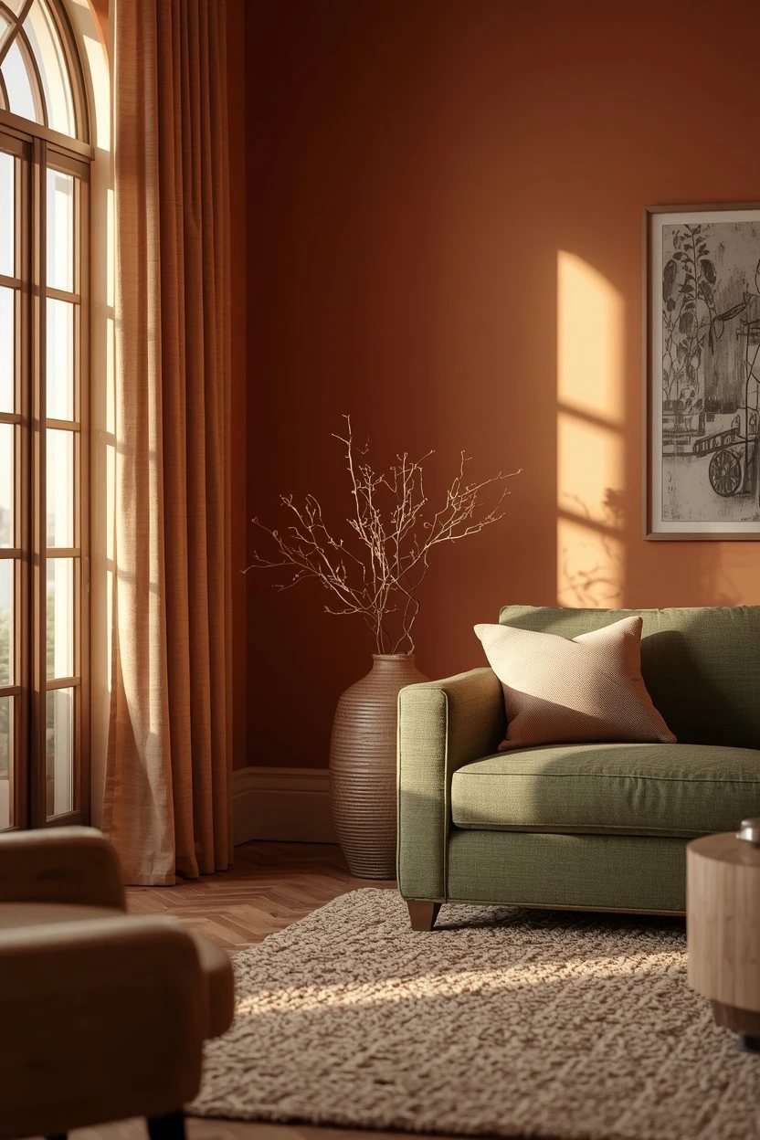
Most living room color ideas articles hand you a list of paint swatches and call it a day, which is why so many rooms end up with a beautiful wall colour surrounded by furniture and textiles that do not speak the same language. Colour in a living room is not one decision — it is a system that includes the walls, the sofa fabric, the rug, the wood tones, and even the light temperature coming through the windows. Getting those layers to talk to each other is the difference between a room that photographs well and one that actually looks good to live in.
Below are eighteen living room color ideas built as complete palettes, not isolated paint picks. Each one describes the wall tone, supporting neutrals, accent colours, material textures, and the kind of light that makes the combination sing. Whether you are repainting from scratch or updating a room around furniture you already own, there is a combination here that will move the needle.
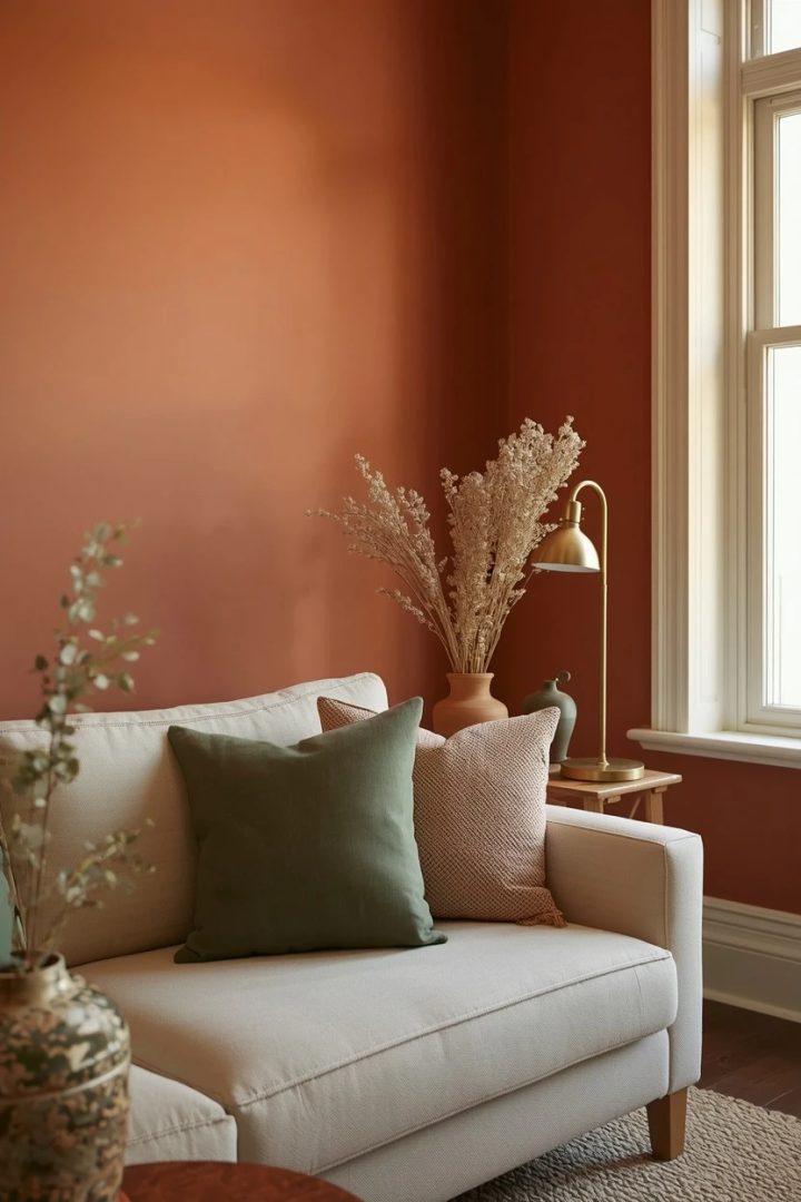
1. Warm Terracotta Walls With Sage Accents
Terracotta on the walls brings a sun-baked warmth that pairs naturally with sage green in cushions, throws, and plant pots. Use a muted terracotta — not a bright orange — to keep the room grounded rather than overstimulating. Pair it with a cream or oatmeal sofa so the wall colour has room to breathe, and introduce sage through linen cushion covers and a ceramic table lamp. Brass hardware and warm oak furniture support the earthy direction without adding more colour.
The key detail is the light: terracotta absorbs cool north-facing light and looks muddy, so this palette performs best in rooms with south or west exposure where afternoon sun intensifies the warmth.
Paint Picks: Benjamin Moore Cavern Clay 662, Sherwin-Williams Warm Stone SW 7536, Behr Canyon Dusk S210-4, Benjamin Moore Cushing Green HC-125 (accent)
2. Deep Navy Accent Wall With Warm Neutrals
A single navy accent wall behind the sofa creates depth without making the room dark, provided the remaining three walls stay in a warm off-white or soft cream. The navy draws the eye to the seating area and acts as a backdrop for artwork, open shelving, or a gallery wall.
Choose a navy with a slight blue-grey undertone rather than a pure cobalt to avoid an overly saturated look under artificial light. Layer in warm wood tones through a walnut coffee table or floating shelves, and add texture with a jute or wool rug in a natural undyed shade.
Paint Picks: Benjamin Moore Hale Navy HC-154, Sherwin-Williams Naval SW 6244, Behr Midnight Blue HDC-CL-26, Benjamin Moore White Dove OC-17 (remaining walls)
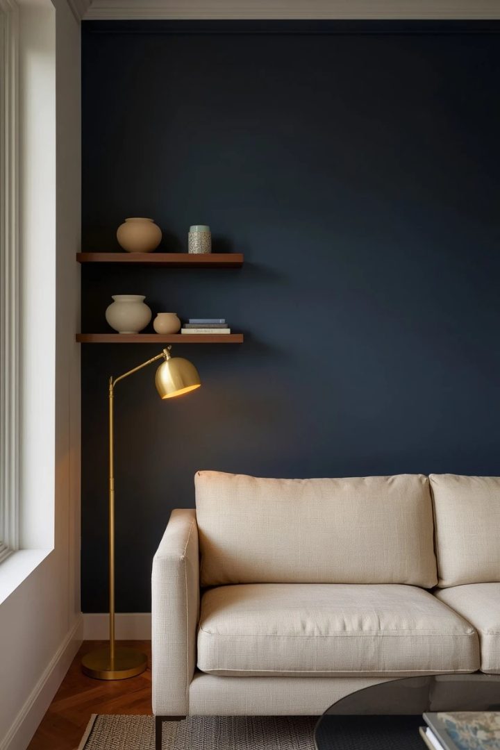
One caution: test the colour at night under your own lamps before committing, because dark blues shift dramatically depending on bulb temperature.
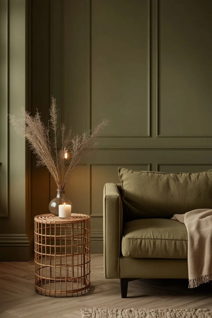
3. Olive Green Mono-Tone Living Room Color Ideas
Going mono-tone with olive green — walls, sofa, and curtains in varying shades of the same hue — creates a cocoon-like room that looks collected rather than matchy. Start with a muted olive on the walls, go one shade lighter on the sofa upholstery, and pick curtains in a deeper moss. Break the mono-tone with contrasting textures: a rough linen throw against a smooth velvet cushion, or a woven rattan side table against a smooth plaster wall. The relief colour comes from your wood tones and metallics — warm brass and light oak keep the greens from looking flat. This approach demands confidence, but when it lands, it delivers a sense of calm that scattered colour palettes rarely match.
Paint Picks: Sherwin-Williams Retreat SW 6207, Benjamin Moore Rosemary Sprig 2144-30, Behr Sage Green N390-4, Sherwin-Williams Pewter Green SW 6208 (deeper accent)
4. Soft Blush and Charcoal for Warm Contrast
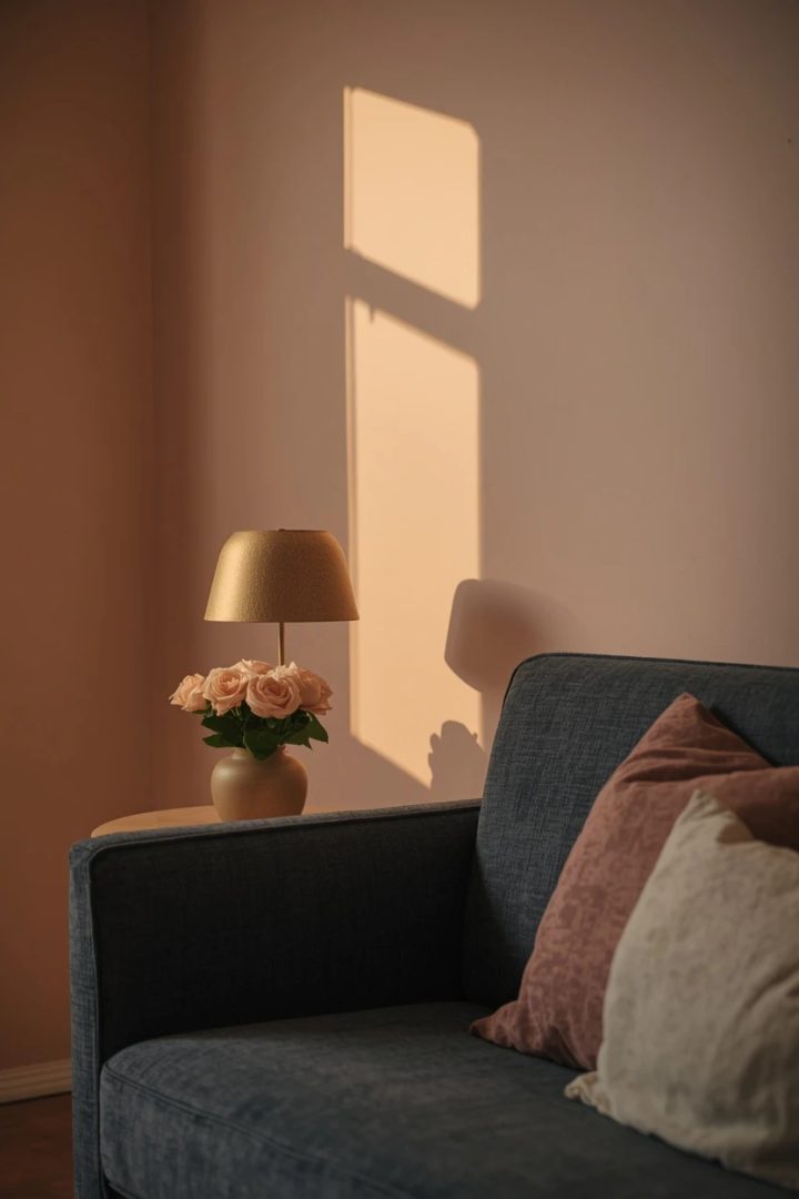
Blush walls paired with charcoal upholstery create a tension between soft and strong that keeps the room interesting. Choose a blush that leans toward a dusty rose rather than a bubblegum pink, so it reads grown-up and works in shared spaces. A charcoal bouclé sofa anchors the room and absorbs the pink reflected light without looking harsh. Add warmth through matte gold or antiqued brass in lighting fixtures and hardware, and use a cream and charcoal patterned rug to ground the seating area.
Fresh flowers in peach or white tones amplify the blush walls during spring and summer months. The trade-off: blush can look washed out in rooms with very cool overhead LEDs, so switch to 2700K warm-white bulbs to preserve the colour payoff.
Paint Picks: Benjamin Moore Pale Berry 2103-60, Sherwin-Williams Fading Rose SW 6296, Behr Mellow Mauve PPG1058-3, Benjamin Moore Charcoal Slate 2126-30 (furniture)
5. Warm White Everywhere With Textural Depth
An all-warm-white room is not a colour cop-out when you build it with texture. Paint the walls in a creamy white with a yellow undertone, upholster the sofa in a nubby white bouclé, and layer a plush off-white wool rug on the floor.
The variation comes from how each surface catches light differently: the matte wall absorbs, the bouclé nubs create tiny shadows, and the wool rug adds a low sheen. Introduce natural materials — bleached oak, pale rattan, raw linen — to prevent the room from reading sterile.
Paint Picks: Benjamin Moore White Dove OC-17, Sherwin-Williams Alabaster SW 7008, Behr Soft Focus PPU7-11
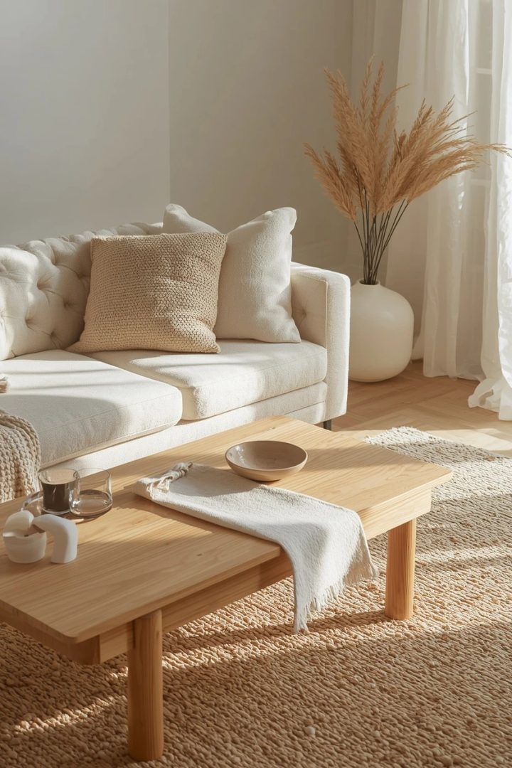
One hard rule: avoid pure optical white anywhere, because it will make everything else look dingy by comparison and flatten the tonal depth you are trying to build.
6. Mustard Yellow Pops Against a Greige Base
Greige — that grey-beige hybrid — is a safe wall colour that benefits enormously from a single bold accent, and mustard yellow delivers that punch without being overwhelming. Keep the greige on all four walls, choose a medium-toned sofa in warm grey, and then introduce mustard through two or three cushions, a single armchair, or a set of curtain panels. The mustard quantity should stay below twenty percent of the visible surface area or it starts to compete with the walls rather than accent them.
Paint Picks: Sherwin-Williams Mega Greige SW 7031, Benjamin Moore Revere Pewter HC-172, Behr Wheat Bread N300-4
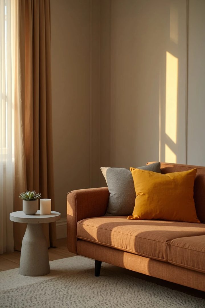
Balance the warmth with a cool element — a single concrete or marble side table prevents the palette from tipping too warm. A linen or wool rug in an oatmeal shade bridges the grey sofa and the yellow accents.
7. Living Room Paint Ideas With Rich Emerald Green
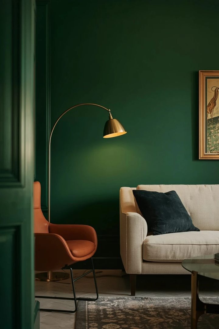
Emerald green walls turn a living room into a jewel box — dramatic, enveloping, and deeply personal. This is a full-commitment colour that rewards you with a room that photographs beautifully and shifts character from day to night. Pair it with warm brass light fixtures, a cognac leather accent chair, and a cream or ivory sofa to provide relief from the intensity. Bookshelves painted the same emerald as the walls create a library effect that blends storage into the architecture. The practical caution is touch-up difficulty: deep greens show roller marks and lap lines easily, so use a high-quality eggshell or satin sheen and apply two coats in the same session to keep a wet edge.
Paint Picks: Benjamin Moore Hunter Green 2041-10, Sherwin-Williams Isle of Pines SW 6461, Behr Perennial Green S-H-460
8. Moody Plum and Warm Grey for Evening Rooms
Plum walls suit living rooms used primarily in the evening, where the deep red-purple tone comes alive under warm artificial light. During the day the colour reads as a sophisticated dark neutral; after sunset it glows with warmth. Pair plum with a warm medium grey sofa and dusty rose or mauve textiles so the colour story stays in the same red-undertone family.
Paint Picks: Benjamin Moore Kalamata AF-630, Sherwin-Williams Plum Brown SW 6272, Behr Mulberry Wine MQ1-38
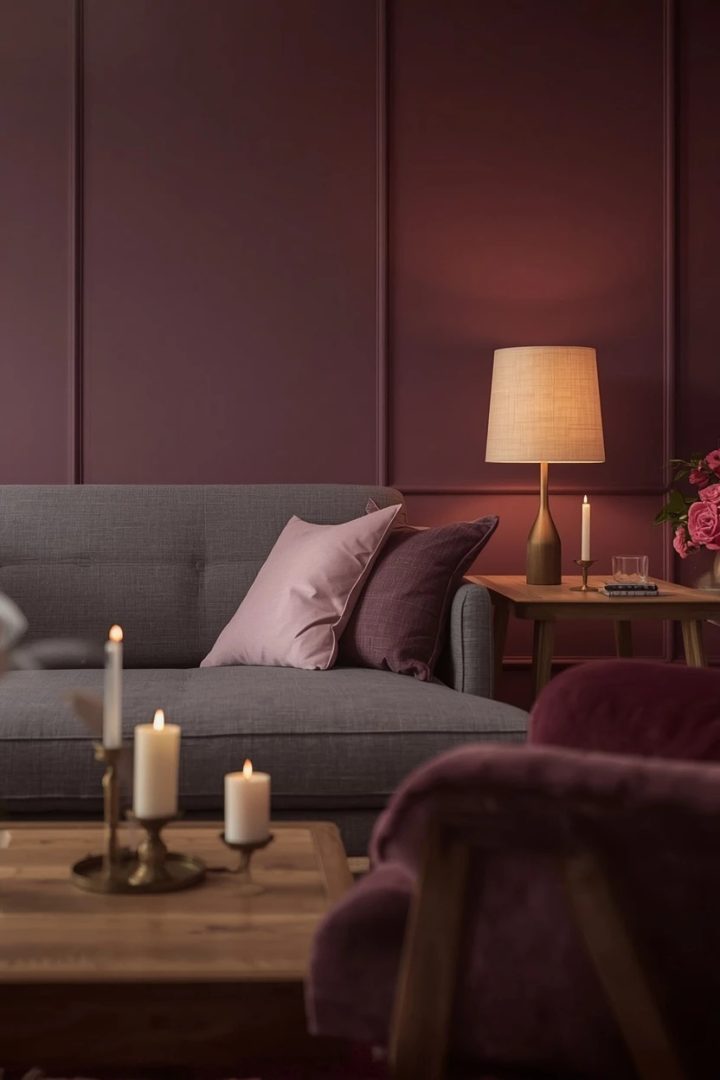
Dark walnut wood furniture grounds the palette, while a single brass table lamp adds a reflective point that bounces light into the plum surface. This is not a colour for small rooms with limited light — it needs at least one large window and a minimum of two evening light sources to avoid caving in visually.
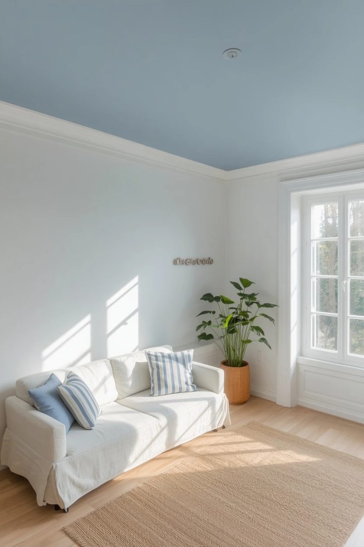
9. Pale Blue Ceiling With White Walls
Painting the ceiling a pale sky blue while keeping the walls white is a classic porch trick that translates surprisingly well to indoor living rooms. The blue overhead mimics open sky and makes the room feel airy and tall without adding colour at eye level that might clash with furniture. Choose a blue with a slight grey undertone — not a baby blue — so it reads sophisticated under indoor lighting. This treatment pairs well with coastal, Scandinavian, and traditional American decor styles and allows complete freedom with furniture colour since the blue sits above the sight line.
Apply the ceiling colour right to the edge of the crown moulding or, if you have no moulding, tape a clean line six inches down the wall for a deliberate colour-block effect.
Paint Picks: Benjamin Moore Breath of Fresh Air 806, Sherwin-Williams Atmospheric SW 6505, Behr Light Drizzle S510-1
10. Tonal Beige Palette for Living Room Color Ideas
A tonal beige room builds warmth through shade variation rather than colour contrast, layering sandy walls with taupe upholstery and dark camel accessories. The trick to keeping it from looking bland is texture variety: a smooth plaster wall next to a chunky wool throw next to a woven rattan basket next to a matte ceramic vase.
Each surface catches light at a different angle, creating shadow and dimension that a single flat beige cannot deliver. Anchor the room with one dark accent — a charcoal iron floor lamp or a black-framed mirror — so the eye has a place to land.
Paint Picks: Benjamin Moore Sandy Brown 1046, Sherwin-Williams Accessible Beige SW 7036, Behr Toasted Cashew N260-3
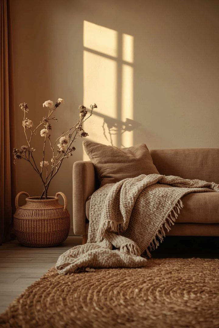
This palette is forgiving of changing light conditions and looks consistent from morning through evening, which makes it a practical choice for multi-use living rooms.
11. Coral and Teal for Vibrant Energy
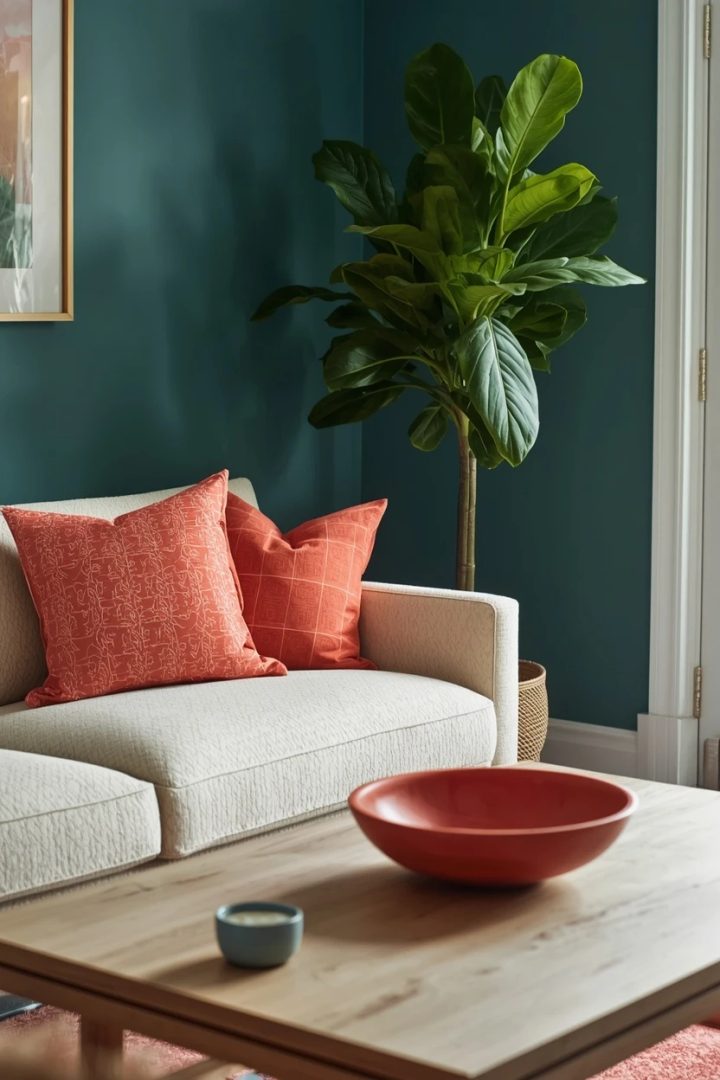
Coral and teal sit opposite each other on the colour wheel, which gives their pairing natural visual tension and energy. Use teal as the dominant wall colour and coral in smaller doses — a pair of cushions, a single accent chair, or a framed print — to keep the combination lively without becoming chaotic. A warm white or cream base for the sofa and rug bridges the two bold colours and prevents them from clashing at full saturation. Light wood furniture in ash or maple keeps the room bright, and a single large houseplant introduces a green note that mediates between the coral and teal. This is a palette built for personality, so avoid too many neutral accessories or the bold colours lose their impact.
Paint Picks: Sherwin-Williams Cloudburst SW 6487 (teal), Benjamin Moore Coral Gables 2010-40 (accent), Behr Ocean Abyss S460-6 (teal alt)
12. Charcoal and Caramel for Grounded Warmth
Charcoal walls paired with caramel leather and warm honey wood create a grounded, masculine-leaning palette that avoids the coldness dark rooms sometimes carry. The caramel leather sofa or armchair introduces a natural warmth that charcoal absorbs beautifully, and honey-toned oak shelves or a coffee table lighten the lower half of the room. Use warm-toned lighting exclusively — table lamps with linen shades in the 2700K range — to keep the charcoal from reading black.
Paint Picks: Benjamin Moore Kendall Charcoal HC-166, Sherwin-Williams Iron Ore SW 7069, Behr Carbon N520-7
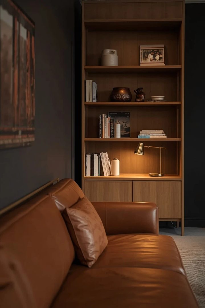
A cream or ivory wool rug prevents the dark walls and dark furniture from collapsing into each other, and a few brass accents add reflective points that bounce lamplight around the space.
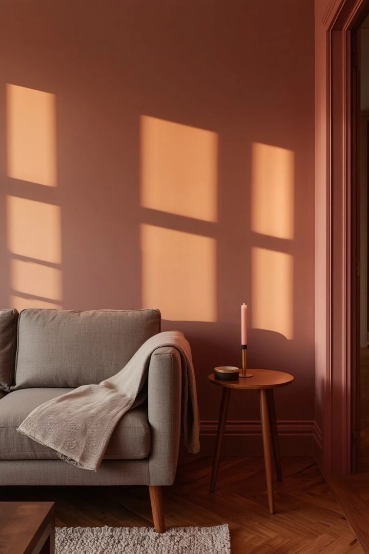
13. Dusty Rose Walls With Warm Wood Tones
Dusty rose has moved far past the nursery and into grown-up living rooms where it delivers warmth without the intensity of red or the sweetness of pink. Pair it with mid-tone walnut or teak furniture so the pink undertone has a warm brown anchor. A sofa in a soft grey or a warm mushroom shade complements the rose walls without competing, and linen curtains in a natural flax tone keep the window treatment grounded. This palette reads especially well in rooms with warm evening light, where the rose glow deepens and the wood tones turn golden.
Avoid pairing dusty rose with cool metals like chrome or polished silver — stick to antiqued brass, matte gold, or oil-rubbed bronze for hardware and fixtures.
Paint Picks: Benjamin Moore Palladian Pink HC-81, Sherwin-Williams Insightful Rose SW 6023, Behr Retro Pink S140-2
14. Living Room Paint Ideas With a Half-Wall Colour Block
Painting the lower half of the wall in a bold colour and the upper half in white or cream creates a modern colour-block effect that adds visual weight to the lower portion of the room without overwhelming the space. The paint line typically sits at chair-rail height — about thirty-two to thirty-six inches from the floor — and can be finished with a clean taped edge or softened with a thin wooden moulding strip.
Deep teal, forest green, or rich terracotta all work well as the lower colour because they ground the room like wainscoting would. The white upper portion keeps the ceiling feeling high, and artwork hung on the white section pops against the clean background.
Paint Picks: Benjamin Moore Yorktowne Green HC-133, Sherwin-Williams Ripe Olive SW 6209, Behr Dark Everglade S420-7
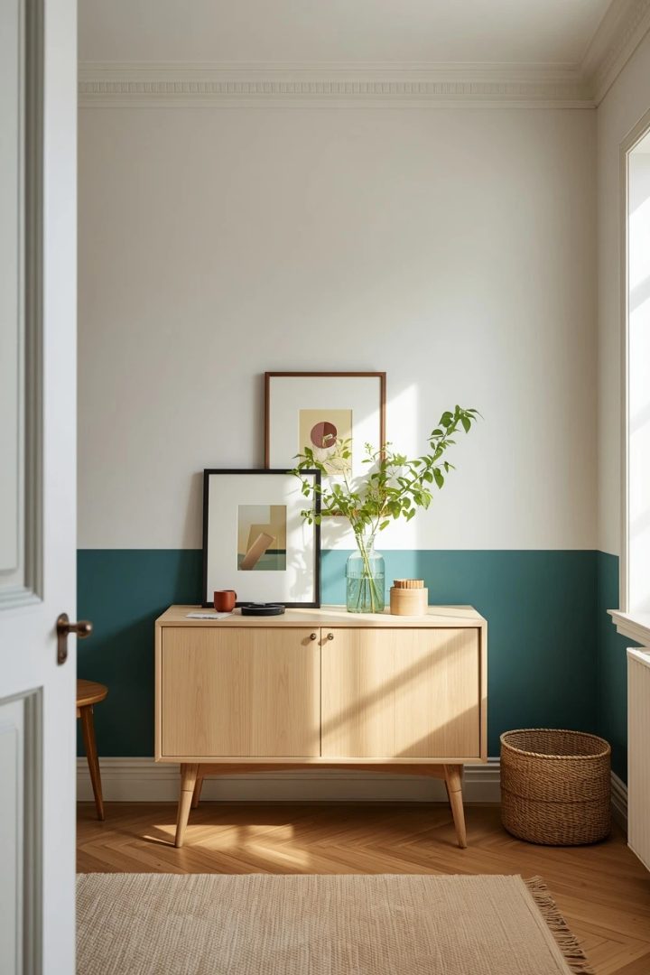
Tape and cut in carefully — the line is the entire detail, so wobbles show.
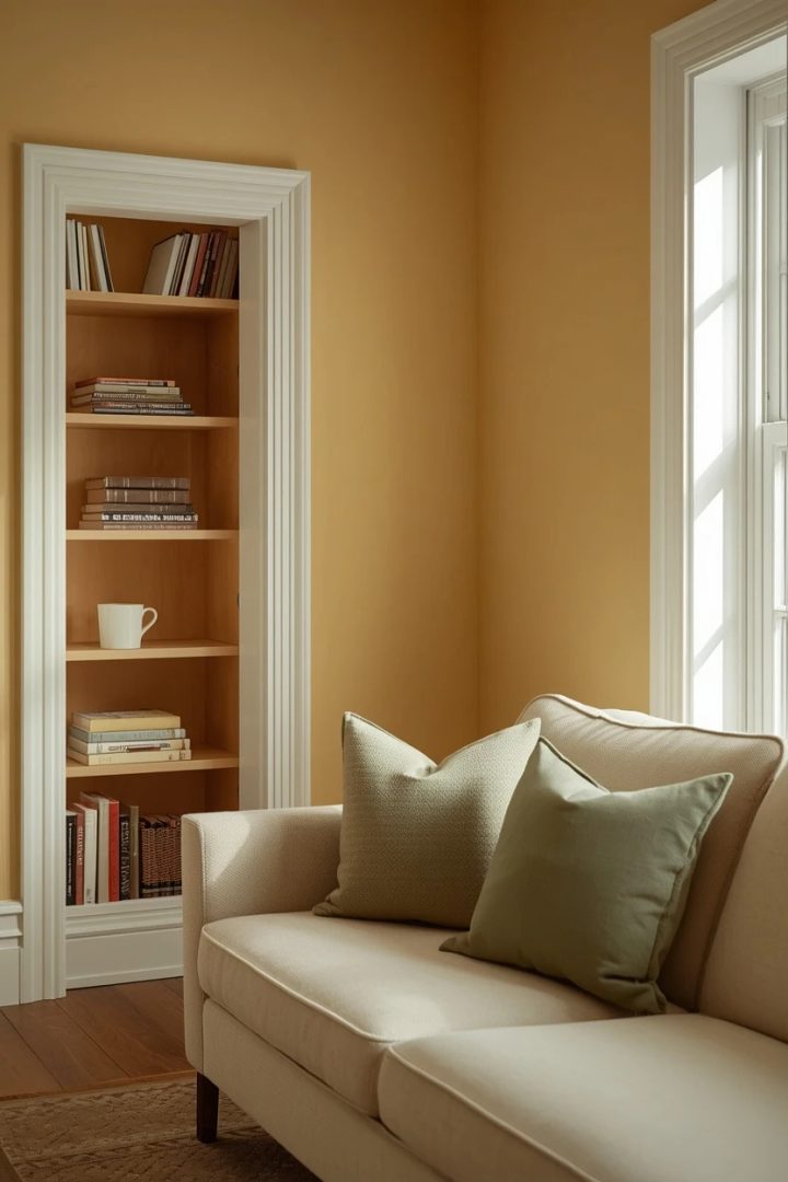
15. Butter Yellow for a Sunny Disposition
Butter yellow walls bring perpetual warmth to north-facing rooms that rarely get direct sun, compensating for the cool light with a colour that radiates its own glow. Choose a soft buttery shade rather than a bright lemon to keep the room comfortable to sit in for long periods. Pair it with white trim, a cream sofa, and accents in soft sage or muted blue for a fresh combination that suits cottage, farmhouse, and traditional styles. Natural wood in pine or light maple reinforces the sunny character, while a sisal or jute rug adds neutral texture underfoot. The practical caveat: yellow amplifies every speck of dust on baseboards and trim, so a room painted this colour demands more frequent cleaning of horizontal surfaces.
Paint Picks: Benjamin Moore Hawthorne Yellow HC-4, Sherwin-Williams Butter Up SW 6681, Behr Sunflower Seed P290-3
16. Slate Grey With Burnt Orange Accents
Slate grey walls provide a cool, contemporary base that burnt orange accents electrify. The key is to treat the orange as punctuation — a velvet cushion, a woven throw, a single ceramic lamp — rather than a co-equal colour. A sofa in charcoal or dark grey keeps the seating area tonal, and a cream-and-charcoal patterned rug introduces movement at floor level.
Paint Picks: Benjamin Moore Kendall Charcoal HC-166, Sherwin-Williams Dovetail SW 7018, Behr Elephant Skin PPU18-16
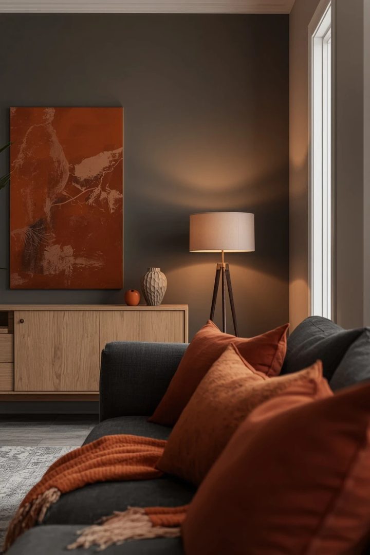
Add warmth through wood elements in a medium oak or ash tone to prevent the grey from tipping cold, and use warm-toned bulbs throughout. This combination is popular in mid-century modern and contemporary Scandinavian rooms where controlled colour contrast matters more than layered maximalism.
17. Soft Lavender for Calm Living Room Color Ideas
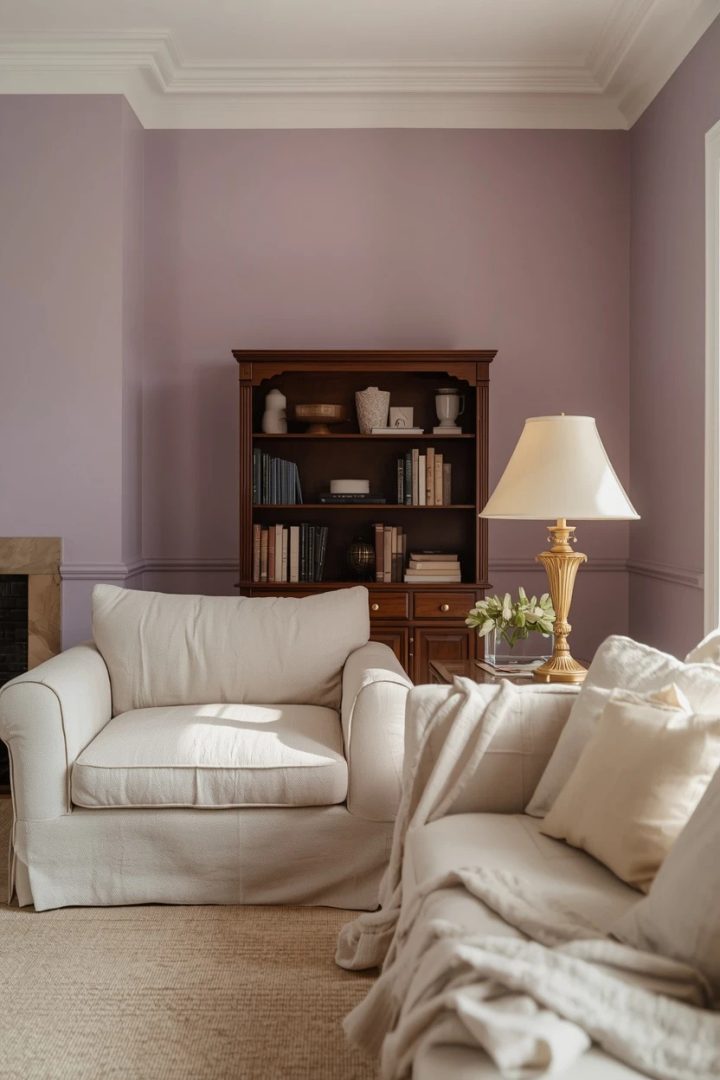
Soft lavender walls wrap a living room in a quiet calm that grey and beige cannot quite achieve. The lilac undertone adds a colour dimension that neutral walls lack while staying restrained enough for daily living. Pair lavender with warm white furniture and natural linen textiles to keep the room airy, and introduce a grounding note through dark wood or matte black picture frames and light fixtures. Gold or brass accents complement the purple undertone better than silver, which pulls the lavender cooler than most rooms need. This palette suits bedrooms and reading-focused living rooms where a contemplative atmosphere is the goal. Test the colour in artificial light before committing — some lavenders shift to grey under warm LEDs and lose their colour character entirely.
Paint Picks: Benjamin Moore Lavender Mist 2070-60, Sherwin-Williams Potentially Purple SW 6821, Behr Dusty Lilac 660C-2
18. Warm Black Feature Wall With Light Surrounds
Painting a single wall in warm black — a black with brown or green undertones rather than a pure jet black — creates a dramatic anchor point without darkening the entire room. The warm undertone is critical: pure black reads like a void under residential lighting, while a warm black looks rich and layered. Keep the remaining walls in a warm white or very pale grey, and use the dark wall to display artwork, a gallery of family photos, or open shelving in a contrasting wood tone.
Paint Picks: Benjamin Moore Black Panther 2125-10, Sherwin-Williams Tricorn Black SW 6258, Behr Jet Black ECC-10-2
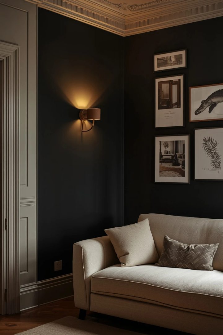
A cream sofa positioned in front of the dark wall pops forward visually, making the seating area the clear focal point. Light the dark wall with a picture light or a pair of wall sconces so it participates in the evening lighting rather than disappearing into shadow.
Where I’d Start if I Only Did Three Things
If I only did three things, I’d start by swapping my overhead bulbs to 2700K warm-white LEDs, because the right light temperature makes every wall colour perform better. Second, I’d paint a single accent wall in a mid-tone that coordinates with my existing sofa — one bold move that resets the room without a full repaint. Third, I’d add two or three textiles in a supporting colour — cushions and a throw — so the accent wall has conversation partners rather than sitting alone.
Frequently Asked Questions
What are the best living room color ideas for small spaces?
Light, warm neutrals like soft cream, warm white, and pale greige open up a small room by reflecting available light. If you want colour, choose a single accent wall in a mid-tone rather than painting all four walls dark — the contrast creates depth while keeping the overall space airy. Avoid very dark colours on every surface, as they absorb light and make limited square footage read even smaller.
How do I pick a wall colour that matches my existing furniture?
Pull the most neutral undertone from your largest piece of furniture — warm if the sofa is beige, taupe, or caramel; cool if it is grey or blue — and choose a wall colour in that same undertone family. Test two or three paint samples directly on the wall and view them at midday and under your evening lighting before committing. The goal is harmony, not an exact match.
Should I paint all four walls the same colour or use an accent wall?
Painting all four walls the same colour creates an enveloping, unified atmosphere that suits deep or saturated tones. An accent wall adds focal-point contrast and suits rooms where you want to draw attention to a seating area, fireplace, or gallery. Neither approach is wrong — the choice depends on the effect you want and the size of the room.
What paint sheen is best for living room walls?
Eggshell or matte are the most popular sheens for living room walls because they minimize glare and hide surface imperfections. Eggshell is slightly easier to wipe clean, making it the better pick for households with children or pets. Avoid flat matte on high-traffic walls since it scuffs visibly, and save satin or semi-gloss for trim, moulding, and doors.
Final Thoughts
Colour sets the emotional baseline of every room you walk into, and the living room deserves more than a random swatch choice. These living room color ideas give you complete palette blueprints — walls, furniture, textiles, and light — so every surface participates in the same visual story. Start with the combination that matches how you want the room to make you and your guests feel, then adapt the specific shades and textures to the light conditions and furniture you already have in place.